The importance of interactive data visualization
In this blog post, we will see how to make interactive visualizations using the popular JavaScript library D3. We will go through the different visualization techniques, before coding an interactive plot called Parallel Coordinates. The goal is to demonstrate the effectiveness of the interactive visualization to convey the message hidden in the data, especially for high dimensional data.
Why interactive visualization is important
We perceive most of the information visually. We have the capability to instantly recognize and localize objects. We group them in the same category regardless of their shape, size, color, distance, cluttered or not. Most of the time, in order to understand some concepts it is always easier to make a sketch. This is due to the immense sophistication of the human visual cortex. That means it is in our nature to comfortably consume and understand visuals.
The same principles hold when we interpret tabular and highly-structured data. We draw 2D or 3D plots, histograms, scatter plots, heat maps, etc. We do this because it is not straightforward to understand the tabular representation of the data. On top of this, to make the experience more immersive, we make the plots interactive. However, we are cursed to perceive the information up to 3 dimensions. Representing data with more than 3 dimensions is a challenging task and we need different strategies.
For this reason, in this blog post, I will show techniques on how to escape the three dimensions married with interactivity for even better perception, by using D3. Stay tuned!
The visualization zoo
We can better understand the world and transfer a clear message by plotting the data we have because a plot is the most convenient and intuitive means to do that. In addition, we can easily upgrade the plots and make them interactive. In this way, the human-computer interaction is more immersive and the results are more interpretable. For instance, just take a look at the amazing interactive plots from Our World in Data. With a simple and yet non-biased and profound analysis and interactive visualization of many open-access data sets, we can clearly comprehend a plethora of the world's phenomena.
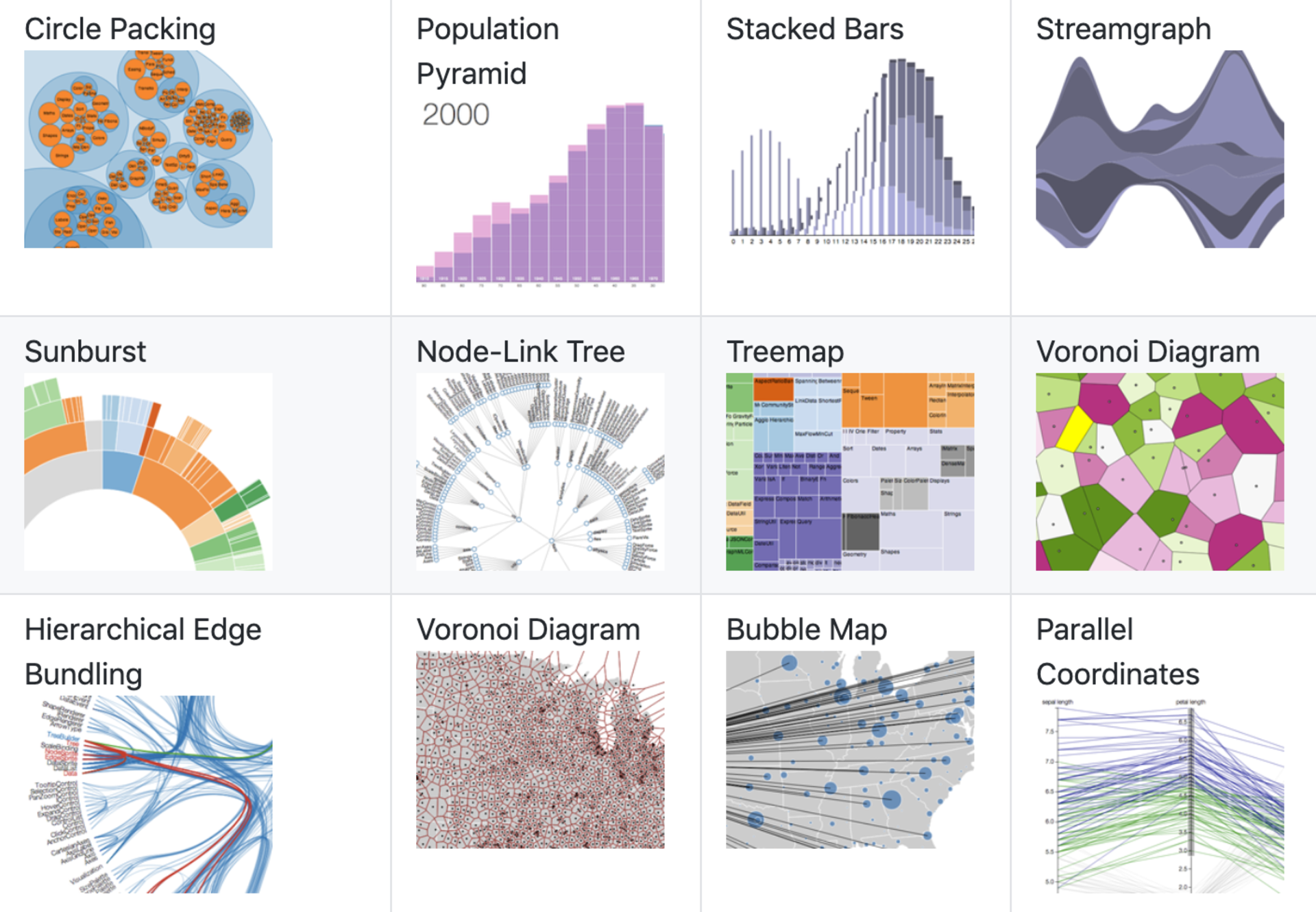
Depending on the aspects and the findings to express, we use different types of plots. The most commonly used plots are nicely summarized in the paper A Tour Through the Visualization Zoo. Generally, they are divided into five categories: Time-Series, Statistical Distributions, Maps, Hierarchies, and Networks. To find out the most recent developments and application of these visualization techniques, follow the work of the Interactive Data Lab at the University of Washington.

There are plenty of tools to generate interactive visualizations. They range from very low-level, customizable and hard to automate tools to high-level automatic tools. In the open-source domain, we have the well established low-level JavaScript library D3. The main advantage of D3 is that we can create very specific and custom plots. Furthermore, we have more high-level visualization tools, Vega and Vega-Lite, both open-source. Vega is built on top of D3 and its aim is to provide a better and faster way to create high-quality graphics only by using JSON syntax. Vega-Lite is even more lightweight and enables quick production of the common statistical plots. On top of this ecosystem, is Voyager, a tool that automates the generation of interactive charts. Voyager is inspired by Tableau, a commercialized and industry adopted tool. This list is not exhaustive of course, there are numerous other tools and libraries, which I include in the Appendix.
Plotting high-dimensional data
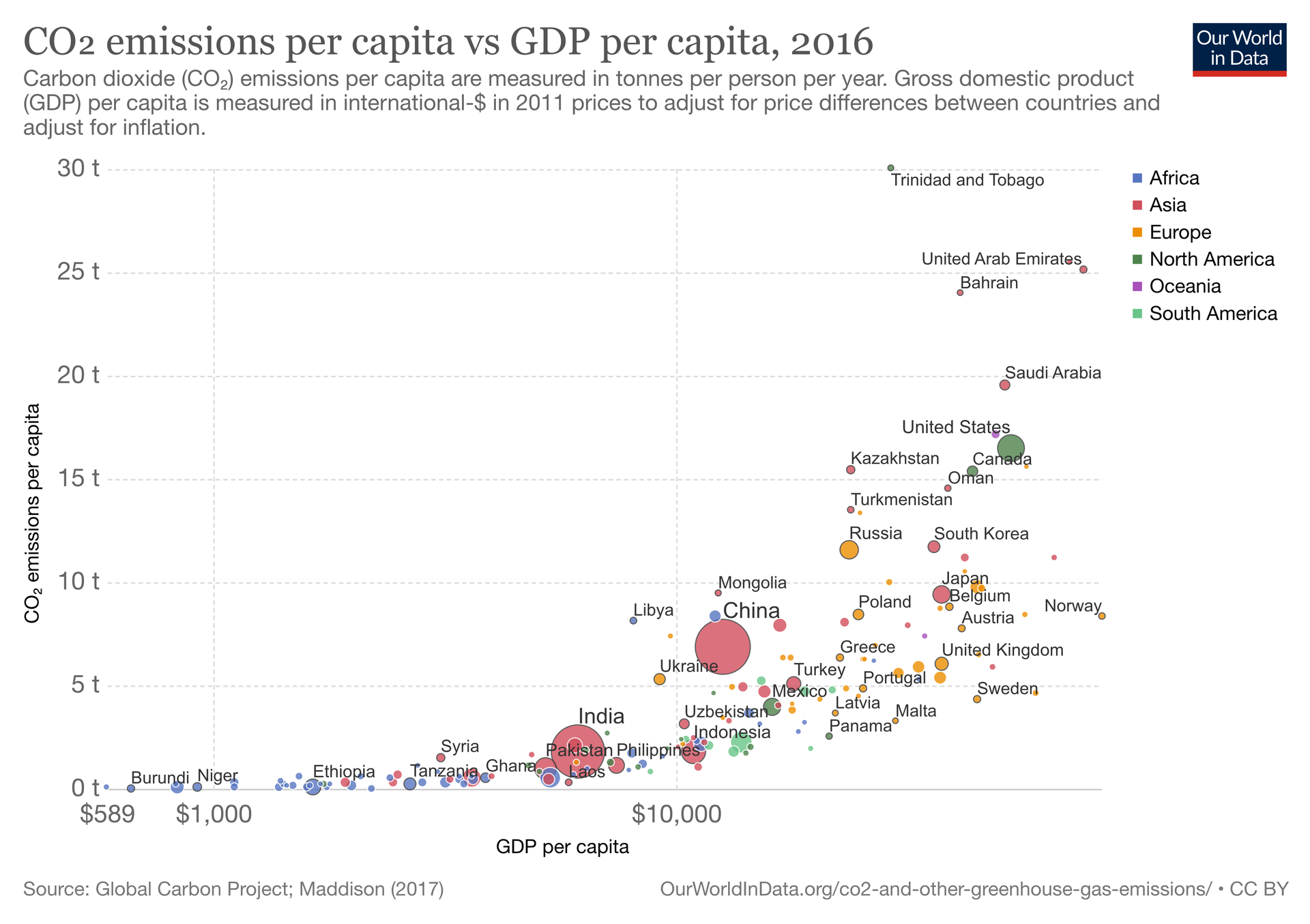
Plotting and understanding 2D and 3D data are simple since we live in a three-dimensional world. For this purpose, we use histograms to plot distributions and line charts to draw relations. Reaching more than 3D is difficult. For this reason we might use different shapes, sizes, colors, and text if some of the data is discrete and finite. For instance, we can use a Bubble Chart, like the one depicted in the figure below.

In fact, we have a five-dimensional data consisting of two continuous dimensions (GDP and CO2 emissions per capita) and three categorical dimensions (country, population, and geo-location). With a simple trick, we represent each country with a circle labeled with the country name, the total population with the size of the diameter, and the geo-location with a color schema.
So far so good! However, this type of plotting has its limitations. We can't represent a considerably high number of dimensions by using these tricks, especially if they are all continuous. For this reason, we have to use some other means to communicate the data. As mentioned in the paper A Tour Through the Visualization Zoo, we can use a plot called Parallel Coordinates.
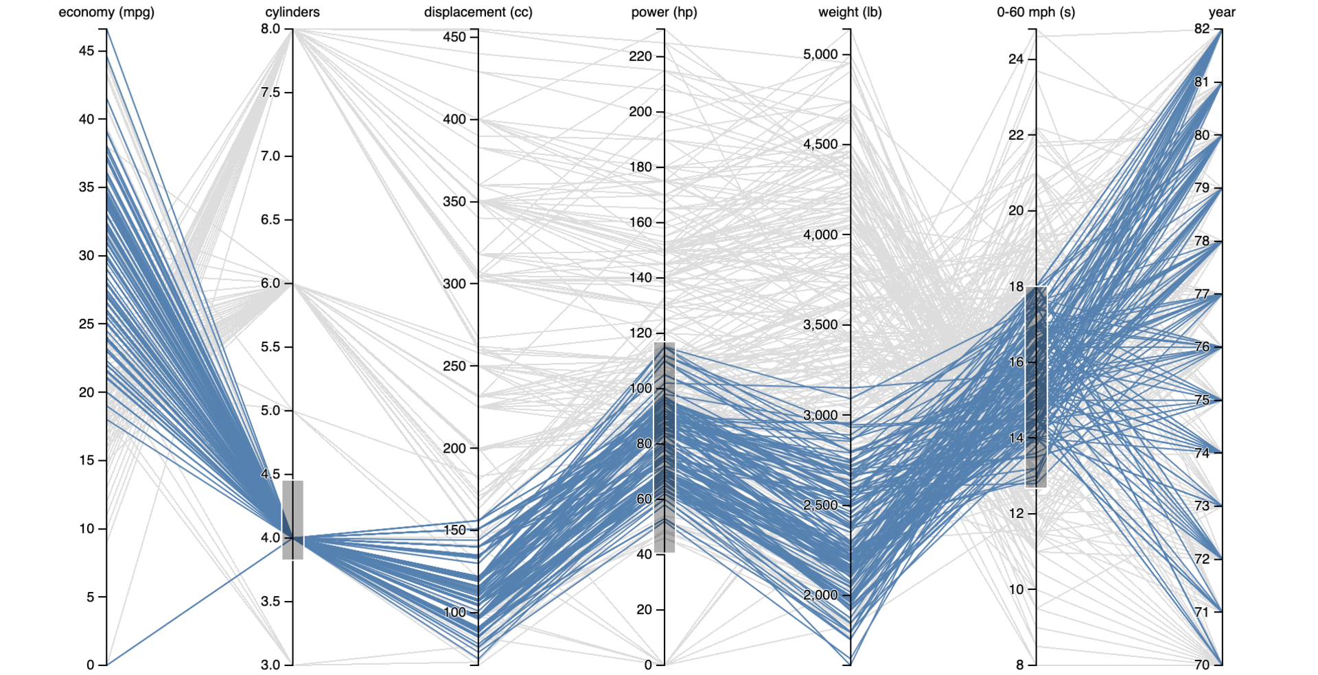
The Parallel Coordinates plot enables us to explore and find patterns in high-dimensional data. Each dimension is represented as a vertical line parallel to the others where the range of values is distributed. Thus, one point in the high-dimensional space is represented as a poly-line connecting the corresponding values on the parallel axes. Additionally, we can select a subset of values in one or multiple axes to filter out the entries. An example is shown in the figure below, which is a visualization of car characteristics.

Hands-on Parallel Coordinates with D3
The main goal of this post is to demonstrate the effectiveness of the interactive visualization, in particular the Parallel Coordinates plot. For this reason, we will show how to give a visual interpretation of a given problem.
Problem Statement
Suppose we want to buy a laptop with certain characteristics that well suits our needs. Usually, we do not have a clue about all the possible options. To read the specifications and compare the different offers, we might get a huge table that resembles like the table below:
Demo
For the purpose of the demo, we use the Laptop Prices data set from Kaggle which you can find it here. It contains 1300 entries with the following 13 columns: Company, Product, Type, Inches, Screen Resolution, CPU, RAM, Memory, GPU, Operating System, Weight, Price.
First, we pre-process the data set in order to clean it and adjust it for plotting, using this Jupyter Notebook. We split the column Memory into two columns SSD Memory and HDD Memory and express the quantities only in Gigabytes. Similarly, we split the column CPU into two other columns, CPU Model Name and CPU Clock Rate. The former contains the model of the CPU, while the latter its clock rate expressed in GHz. For the GPU column, we only take the part containing the model name. Furthermore, the values in the column named Ram contain the suffix GB, which is redundant, thus we remove it. Finally, for the Screen Resolution column, we only take the part containing the screen resolution in pixels, discarding the rest of the description. In the end, the data set format is like the one shown in Table 1.
Using the transformed data set we create the Parallel Coordinates plot. For convenience reasons, we only use 10 columns, assigning each one a vertical axis in the plot. Every axis has a description on top of it and a range of values depending on the type of data it holds: 1. numeric or 2. string. In the case of numeric data, the range is from the minimum to the maximum, separated with equidistant ticks ascending from bottom to top. In the case of strings, the range is from the first to the last alphabetically sorted string, each represented with one tick. Thus, one laptop is fully specified with one poly-line stretching from the most left to the most right axis. The poly-lines are colored according to the Company value in order to distinguish them easily.
The plot is interactive, such that, on each axis, we can select a subset of values in which we are interested, by dragging the mouse pointer over it. In addition, we can slide this range over the axis. Automatically, not selected values are filtered out. To augment the search, the table below the plot dynamically updates with the 5 cheapest laptops in the current selection. To restart the selection, one needs to click out of the selected range.
Now, the laptop search is much easier and intuitive. We can set different constraints for every column and notice the changes and compare the fewer options. Try it out yourself below!
The main advantage of this plot is that we can intuitively understand and plot multi-dimensional data. However, if the number of dimensions is very big, we can't plot all of them, since the plot will be too condensed and confusing. Moreover, it is not well suited for categorical data. The number of categories must be sufficiently small in order to place them all on one of the axes.
The full code to run this interactive visualization can be found here. For more information please follow me on Twitter.
If you liked what you just saw, it would be really helpful to subscribe to the mailing list below. You will not get spammed that's a promise! You will get updates for the newest blog posts and visualizations from time to time.
Conclusion
In this blog post, we see the importance of interactive visualization to understand our data better and make our searches faster. There are many different types of plots depending on the data nature and the task to perform. One of them is the Parallel Coordinates plot that enables us to scale easily to more than 3 dimensions. Out of the many existing tools for plotting, we use D3 for a hands-on experience to create a Parallel Coordinates interactive plot augmented with a dynamic table in the laptop searching domain. This plot has many potential uses and next time we will see how to apply it in the domain of Machine Learning.
Appendix
JavaScript libraries
The following list includes popular open-source JavaScript libraries and tools for visualization
- Chart JS: it offers 8 fully responsive charts for mobile and web developers
- Crossfilter: a library optimized for loading and exploring huge data sets, with millions of entries
- DC.js: used to create multiple charts on the same data set that update dynamically together
- Plotly.js: built on top of D3, it offers more than 40 charts
- Cola.js: for plotting graph-based data
- Leaflet: for plotting mobile-friendly interactive maps
- MetricsGraphics.js: optimized for plotting time-series data
Python Libraries
The following list includes popular open-source Python libraries and tools for visualization
- Matplotlib: mainly and mostly used for scientific plotting
- Seaborn: based on Matplotlib for drawing more appealing chars
- Bokeh: interactive visualizations mainly used for web applications
- Altair: a Python variant of the Vega-Lite visualization grammar
- Plotly: the Python wrapper of Plotly.js
Learning Resources
Check out how to use the parallel coordinates plot for tracking and visualizing Machine Learning models.
The following list contains an awesome set of resources to learn to plot with D3


Leave a comment